")

Why Responsive Web Design is Good for SEO: 5 Key Reasons
Why responsive web design is good for seo? Easily put, it boosts your website’s visibility and performance on search engines. Here’s why:
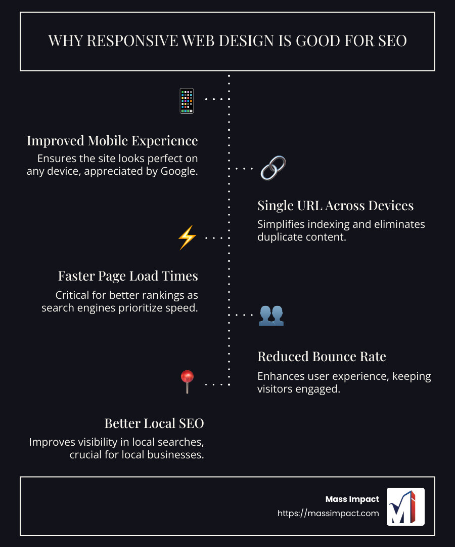
- Improved Mobile Experience: Responsive design ensures your site looks perfect on any device, and Google loves mobile-friendly sites.
- Single URL Across Devices: Simplifies indexing and eliminates duplicate content.
- Faster Page Load Times: Critical for better rankings, as search engines prioritize speed.
- Reduced Bounce Rate: A better user experience keeps visitors engaged, signaling to search engines that your site is relevant.
- Better Local SEO: Improves visibility in local searches, crucial for businesses targeting local customers.
In today’s competitive digital landscape, having an optimized, user-friendly website is more than just a nice-to-have—it’s essential for SEO success. As search engines like Google continue to prioritize mobile-friendly and fast-loading sites, investing in responsive web design has become crucial. Responsive web design not only ensures your site looks good on any device but also improves the overall user experience, leading to improved search engine rankings and increased visibility. This approach encompasses fluid grids, flexible images, and media queries to adapt seamlessly to various screen sizes, making it possible for businesses to capture more of their target audience and boost their online presence.
I’m Haiko de Poel Jr., and with my background in digital branding and SEO strategy, I know exactly why responsive web design is good for seo. My expertise in weaving SEO into effective marketing strategies has empowered countless businesses to open up their full digital potential. Now, let’s dive into how responsive web design can revolutionize your approach to SEO and online visibility.
Quick why responsive web design is good for seo terms:
– dental search engine optimisation
– search engine friendly websites
– website design and search engine optimization
What is Responsive Web Design?
Responsive web design is a modern approach to creating websites that look and function well on any device. Whether your visitors are using a smartphone, tablet, or desktop computer, responsive design ensures a seamless experience. By utilizing fluid grids, flexible images, and media queries, responsive web design adapts to different screen sizes and resolutions.
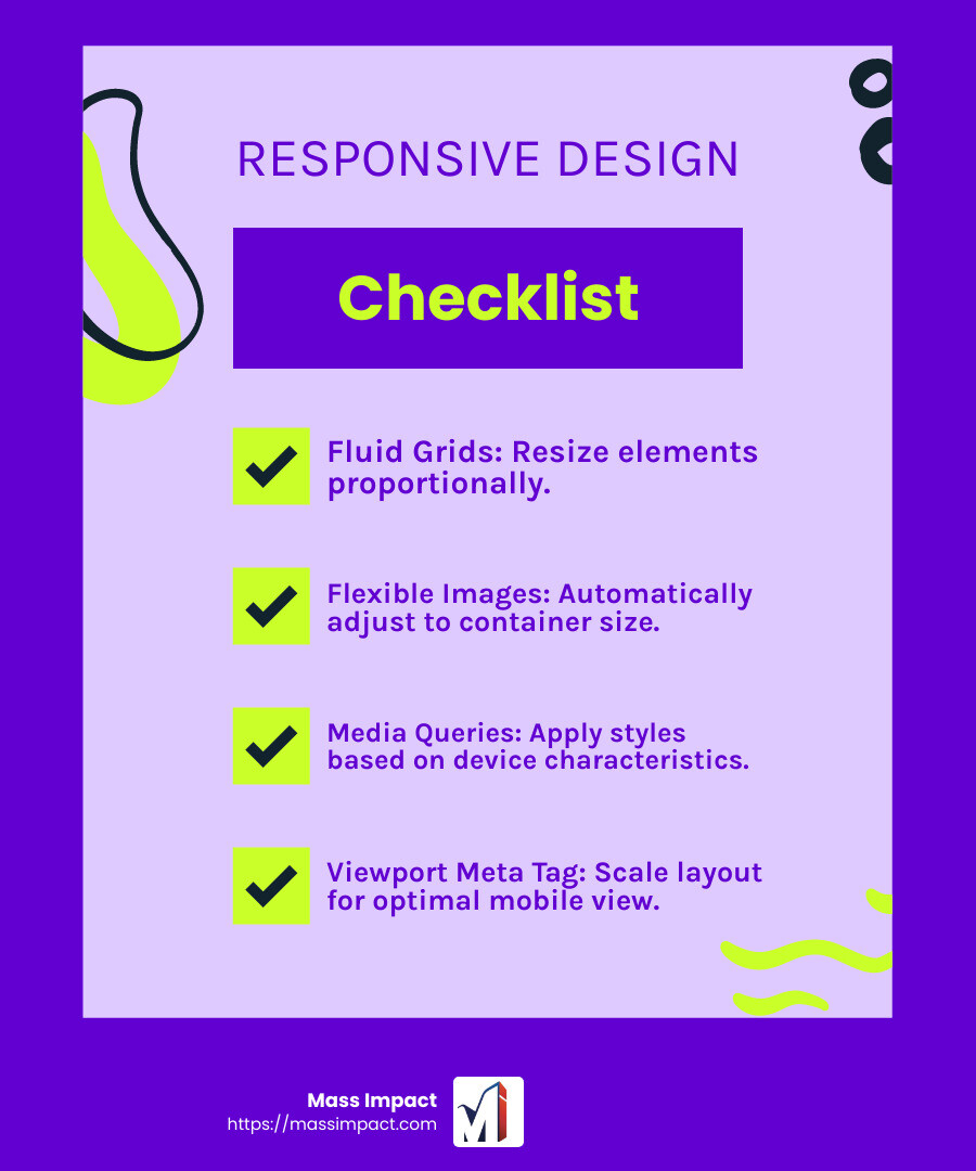
Fluid Grids
Fluid grids are the backbone of responsive web design. Unlike fixed-width layouts that stay the same size regardless of the screen, fluid grids use percentages to define the width of elements. This means that the layout can resize proportionally to fit any screen size. Imagine a grid that stretches and shrinks like a rubber band—this flexibility allows your website to look great on both large monitors and small phone screens.
Flexible Images
Flexible images automatically adjust their size based on the dimensions of their container elements. This prevents images from appearing too large or too small on different devices. For example, an image on a desktop might fill half the screen, while on a smartphone, it scales down to fit the smaller display. This ensures that images are always clear and appropriately sized, enhancing the visual appeal of your site.
Media Queries
Media queries are CSS rules that apply different styles based on the characteristics of the device being used. These characteristics can include the device’s width, height, orientation, and resolution. By using media queries, designers can customize the appearance of a website for various devices. For instance, a website might use a single-column layout on a phone but switch to a multi-column layout on a tablet. This customization provides users with an optimal viewing experience, no matter what device they’re using.
Viewport Meta Tag
The viewport meta tag is a critical tool for controlling the layout on mobile devices. It ensures that web pages are scaled correctly to fit the screen width of any device. By setting the viewport, developers can prevent issues like horizontal scrolling and ensure that content is displayed at a readable size. This leads to an optimal viewing experience, which is crucial for keeping visitors engaged and reducing bounce rates.
Responsive web design is not just about aesthetics; it’s about creating a user-friendly experience that adapts to the needs of your audience. By incorporating fluid grids, flexible images, media queries, and the viewport meta tag, your website can provide a consistent and enjoyable experience across all devices. This not only improves user satisfaction but also plays a pivotal role in improving your site’s SEO performance.
Next, we’ll explore why responsive web design is good for SEO and how it can lift your website’s search engine visibility.
Why Responsive Web Design is Good for SEO
Responsive web design is a game-changer when it comes to SEO. It’s not just about making your site look good; it’s about making it perform better in search engine rankings. Let’s dive into the reasons why responsive web design is good for SEO.
Improved Mobile Experience
With smartphones now surpassing desktops in web usage, having a mobile-friendly site is crucial. Google prioritizes mobile-friendly sites in its rankings because they provide a better user experience. Responsive design ensures your site functions correctly on mobile devices, offering a seamless experience that keeps visitors engaged.
Single URL for All Devices
Responsive design uses a single URL for all devices. This consistency makes it easier for search engines to crawl and index your site. A single URL also means you don’t have to worry about duplicate content issues, which can negatively impact your SEO. Plus, it simplifies sharing your site on social media, boosting your visibility.
Reduced Bounce Rate
A better user experience leads to a lower bounce rate. When users find relevant content and can easily steer your site, they’re more likely to stay longer. This engagement sends positive signals to search engines, indicating that your site is valuable and relevant, which can improve your rankings.
Faster Page Load Times
Page speed is a critical factor for SEO. Search engines favor sites that load quickly. Responsive design often results in faster load times because it eliminates the need for redirects between mobile and desktop versions. This speed not only improves the user experience but also boosts your SEO performance.
Easier Social Sharing
Having a consistent URL across devices makes social sharing a breeze. When users find content they love, they’re more likely to share it. Increased social sharing can lead to more visibility and potential backlinks, both of which are beneficial for SEO.
Avoidance of Duplicate Content
Responsive design means you only have one version of your site, reducing the risk of duplicate content. Duplicate content can confuse search engines and harm your SEO. By maintaining a single, responsive version, you ensure that search engines know exactly which content to prioritize.
Better Local SEO
Responsive sites offer a good mobile experience, which is vital for local searches. Many people use their smartphones to find local businesses. By providing a mobile-friendly experience, your site is more likely to rank higher in local search results, driving more foot traffic to your business.
Responsive web design is more than just a trend; it’s a necessity for successful SEO. By improving user experience, streamlining URLs, and enhancing site performance, responsive design lays a solid foundation for better search engine rankings. Next, we’ll dig into the benefits of responsive web design for user experience and how it can further boost your site’s performance.
Benefits of Responsive Web Design for User Experience
Responsive web design is not just about aesthetics; it’s about creating a seamless and enjoyable user experience across all devices. Let’s explore how this approach improves the user experience, focusing on consistent experience, improved navigation, and increased engagement.
Consistent Experience Across Devices
Imagine visiting a website on your desktop and then checking the same site on your smartphone. With responsive design, the transition feels natural. The site automatically adjusts to fit the screen size, whether it’s a desktop, tablet, or mobile phone. This consistency boosts user satisfaction because visitors know they’ll get the same quality experience no matter what device they use.
Having a consistent experience is not just about looks; it’s about functionality. Responsive design ensures that all interactive elements work smoothly, reducing frustration and encouraging users to spend more time on your site.
Improved Navigation
A key aspect of user experience is navigation. Users should find it easy and intuitive to move through your site. Responsive design focuses on creating a user-friendly navigation system that adapts to different screen sizes. On smaller screens, this might mean simplifying menus or using icons to save space while maintaining functionality.
For instance, many responsive sites use a “hamburger” menu on mobile devices, which expands when clicked, showing the full menu without cluttering the screen. This approach makes it easy for users to find what they need quickly, reducing the likelihood of them leaving your site out of frustration.
Increased Engagement
When a site is easy to steer and offers a consistent experience, users are more likely to engage with the content. Longer visits and higher interaction rates are common outcomes of effective responsive design. Users who can effortlessly browse your site are more inclined to explore different sections, read more content, and interact with features like forms or comment sections.
A responsive site also contributes to a lower bounce rate. When users find what they’re looking for without hassle, they are less likely to leave immediately. This decreased bounce rate is not only good for SEO but also for understanding your audience’s interest and behavior.
By focusing on a seamless user experience, responsive web design encourages visitors to stay longer and engage more deeply with your content, which can lead to higher conversion rates and customer satisfaction.
In the next section, we will explore how to implement responsive web design, ensuring your site is set up for success across all devices.
How to Implement Responsive Web Design
Creating a responsive website involves several key elements to ensure your site looks and functions well on any device. Let’s break down the essential techniques: fluid grids, flexible images, media queries, and the viewport meta tag. We’ll also touch on the role of professional services in achieving a seamless design.
Fluid Grids
Fluid grids are the backbone of responsive design. They use percentages instead of fixed units like pixels to define the width of elements. This flexibility ensures your layout adapts to different screen sizes. Imagine your website layout as a liquid that flows to fill any container—whether it’s a large desktop monitor or a small smartphone screen.
Using fluid grids means your site will maintain its structure and appearance across all devices, providing a consistent user experience.
Flexible Images
Images are crucial for any website, but they can cause issues if not handled correctly. Flexible images automatically resize within their container elements, ensuring they scale appropriately for different screens. This prevents images from appearing too large or too small, which can disrupt the visual balance of your site.
By implementing flexible images, you ensure that your visuals look crisp and professional, no matter the device.
Media Queries
Media queries are CSS rules that allow you to apply different styles based on the device’s characteristics, such as screen size and resolution. This customization lets you tailor the appearance of your site to suit various devices, ensuring an optimal viewing experience for all users.
For example, you might use a media query to change the font size on smaller screens, making text easier to read on mobile devices. This kind of customization improves usability and keeps users engaged.
Viewport Meta Tag
The viewport meta tag is essential for controlling how your website is displayed on mobile devices. It helps scale your site to fit the screen width of any device, ensuring content is easily readable without the need for zooming or horizontal scrolling.
By setting the viewport width to the device’s width, you ensure a smooth, user-friendly experience, which is crucial for keeping visitors on your site.
Professional Services
While implementing responsive web design can be straightforward, it often requires expertise to ensure everything works seamlessly. Professional services can provide comprehensive solutions, from initial design to ongoing support. They bring experience and quality assurance, ensuring your site not only looks great but performs well.
These services can also integrate advanced SEO strategies, improve scalability, and ensure faster load times, which are critical for maintaining a competitive edge online. By partnering with experts, you can focus on your business while they handle the complexities of web design.
Responsive web design is a must in today’s digital landscape. By implementing these techniques, you can create a site that offers a superior user experience across all devices.
In the next section, we will address some frequently asked questions about responsive web design and SEO, helping you understand why this approach is essential for your online success.
Frequently Asked Questions about Responsive Web Design and SEO
Why is responsive web design important for SEO?
Responsive web design is crucial for SEO because it improves the user experience, which search engines like Google prioritize. When a site is mobile-friendly, it ensures that users can easily steer and engage with content on any device, from smartphones to tablets. Google favors sites that provide a seamless experience across all platforms, often ranking them higher in search results.
Moreover, responsive design uses a single URL for all devices, making it easier for search engines to crawl and index your site. This uniformity helps in maintaining consistent link equity and avoids the complications associated with having multiple URLs for different devices.
How does responsive web design improve SEO?
Responsive web design contributes to better SEO in several ways:
-
Reduced Bounce Rate: A site that adapts to different screen sizes offers a better user experience, keeping visitors engaged and reducing bounce rates. This signals to search engines that your site is relevant and valuable.
-
Faster Load Times: Responsive sites are optimized for quick loading, a critical SEO factor. Fast-loading pages improve user satisfaction and are favored by search engines.
-
Easier Social Sharing: With a consistent URL for each piece of content, sharing on social media becomes simpler, increasing your site’s visibility and potential for backlinks.
-
Avoidance of Duplicate Content: Having a single version of your site for all devices prevents duplicate content issues, which can negatively impact SEO.
What are the key principles of responsive web design?
Several principles form the foundation of responsive web design:
-
Fluid Grids: These use percentages to define element widths, allowing the layout to resize proportionally to the screen size. This ensures your site looks great on any device.
-
Flexible Images: Images automatically adjust their size within their containers, preventing them from appearing too large or too small on different screens.
-
Media Queries: These CSS rules apply styles based on device characteristics, such as screen width, allowing for custom display adjustments that improve usability.
-
Viewport Meta Tag: This tag controls the layout on mobile devices, ensuring content is scaled correctly to fit the screen width for an optimal viewing experience.
By incorporating these principles, you ensure your website is not only visually appealing but also optimized for SEO success. In the next section, we will explore the benefits of responsive web design for user experience, diving deeper into how it improves engagement and satisfaction across various devices.
Conclusion
At Mass Impact, we understand that a strong online presence is not just about having a website; it’s about having a website that works for you. Our expertise in digital marketing, particularly in SEO web design, ensures that your business stands out in a crowded digital landscape.
Responsive web design is a cornerstone of our strategy. By implementing it, we help businesses improve their search engine rankings and provide a seamless user experience across all devices. This approach not only attracts more visitors but keeps them engaged, ultimately leading to higher conversion rates.
Our team is dedicated to creating websites that are not only visually appealing but also functional and easy to steer. We use the latest techniques in responsive design, such as fluid grids and flexible images, to ensure your website adapts perfectly to any screen size. By doing so, we improve user satisfaction and reduce bounce rates, key factors that search engines like Google consider when ranking sites.
Moreover, our SEO expertise ensures that every aspect of your website is optimized for search engines. From faster load times to avoiding duplicate content, we cover all bases to improve your site’s visibility. We also make social sharing effortless, further boosting your site’s reach and potential for backlinks.
Choosing Mass Impact means you’re not just getting a website; you’re getting a comprehensive digital marketing solution that sets you apart from the competition. Our creative solutions are custom to meet your business goals, ensuring that your online presence is as strong as it can be.
Ready to lift your digital presence with SEO web design? Find how Mass Impact can transform your business. Let’s create something amazing together!


